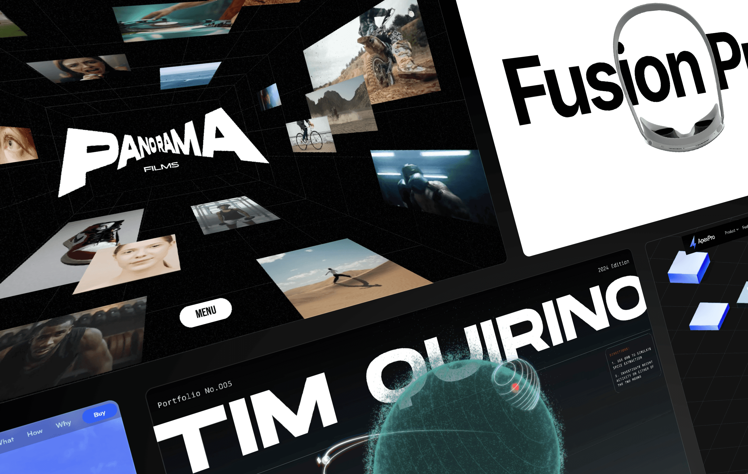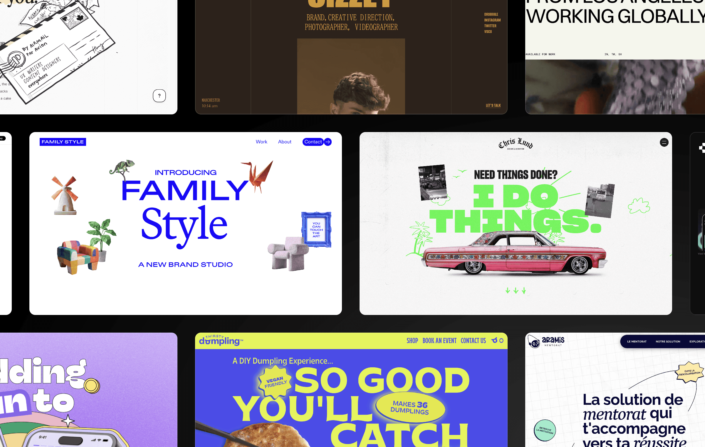


Feast your eyes on interactive menus as we unveil the highlights of the 9th Framer Challenge. In this article, we’ll take you on a tour of the most captivating entries.
Ademar Rodrigues — Inspired by Apple’s dynamic island
The winning entry by Ademar Rodrigues stood out with his interactive menu design inspired by Apple’s dynamic island. His menu provided an intuitive and delightful user experience with smooth transitions and visually engaging elements.
Mateusz Najuch — Sleek semi-transparent menu with dynamic interactions
Mateusz Najuch impressed us with a sleek semi-transparent menu design. With smooth interactions, the icons are transformed into names once clicked, providing users with clear navigation options and an elegant UI experience.
Renzo Bianchi — Minimalistic hover effects in horizontal and side menus
Renzo Bianchi showcased two noteworthy menus. The horizontal menu boasted minimalistic smooth hover effects, while the big side menu presented a clean and spacious design. Both entries demonstrated a minimalist approach, ensuring a visually pleasing and user-friendly experience.
Ludovic Losco — Blurring elements for enhanced focus
Ludovic Losco’s entry caught our attention with an interesting concept. When hovering over an item in the menu, the rest of the items were intentionally blurred. This unique approach added an element of intrigue and enhanced the focus on selected menu items.
Participate in Our Latest Challenge
That’s a wrap! We hope you enjoyed this showcase of the Framer Challenge: Interactive Menus. Congratulations to the winner and all participants for their outstanding contributions. If you’re hungry for more design challenges and opportunities to showcase your skills, make sure to visit our Community platform. You’ll find the latest challenge waiting for you there, offering a chance to win an exclusive Community Badge and a Framer merch pack, including a t-shirt, stickers, notebook, and pen.

Step into the future of design
Step into the future of design
Step into the future of design
Join thousands using Framer to build high-performing websites fast.
Join thousands using Framer to build high-performing websites fast.
Join thousands using Framer to build high-performing websites fast.


